
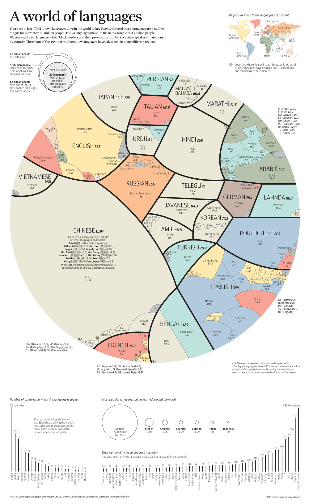
This fascinating infographic elegantly breaks down the most popular languages in the world as well as the countries in which they're spoken. Specifically, the large circle represents the 4.1 billion people who speak one of the world’s 23 most-spoken languages as their mother tongue – the numbers of people speaking an actual language in any given country might be higher. The infographic was created for the South China Morning Post by an infographic journalist, Alberto Lucas López. Be sure to view the full-sized version to get all the details!
More info: lucasinfographic.com | Twitter | scmp.com (h/t: designtaxi)
Click here for the full-sized image.
Read the unit before the ranking
A graphic about mother tongues answers a different question from one counting everyone who can use a language. A person who speaks several languages may appear once in one dataset and contribute to several totals in another. The definition determines what the circles mean.
Next, look at how the country subdivisions fit inside each language group. They illustrate distribution within the selected data, rather than implying a country has only one language. Keep the original publication context beside the image; a historical infographic can remain a useful design example even when its population estimates are no longer current.
Area is the quantity the design asks you to compare
In a circle-based population graphic, the visible area carries the numerical comparison. Looking only at a circle’s width can give a misleading impression of the relationship between groups. The nested country labels add a second task: first compare language totals, then inspect how each selected total is distributed within the graphic’s data.
Explore a related story: English-Language Jokes About Spelling, Meaning and Expectations.
About the graphic
Alberto Lucas López’s graphic, titled “A World of Languages – and How Many Speak Them”, appeared in the South China Morning Post in 2015. It starts from the fact that there are at least 7,102 known living languages, and shows the 23 that are each the mother tongue of more than 50 million people; together they are the first language of 4.1 billion people. Because it counts only first-language speakers, it does not show people who speak a language as a second or foreign language, and multilingual speakers are not accounted for.
Sources: Cool Infographics, 1 June 2015: A World of Languages


COMMENTS