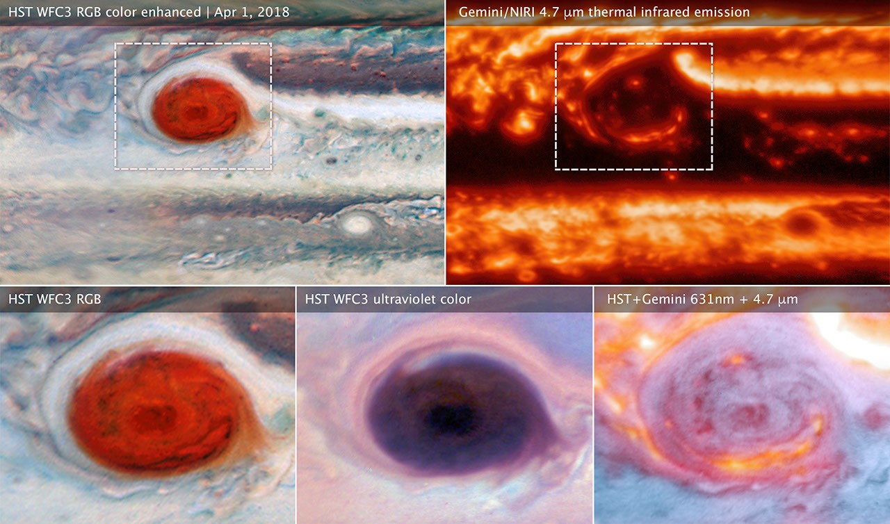
In one image, Jupiter wears familiar cream and rust-colored bands. In another, parts of the planet glow through a dark network of clouds. The difference is not a change of planet or a decorative filter. Different wavelengths reveal different things about its atmosphere.
Three observatories, complementary views
Research publicized in 2020 combined observations from the Hubble Space Telescope, the ground-based Gemini North telescope and NASA’s Juno spacecraft. Hubble supplied detailed views at visible and ultraviolet wavelengths, Gemini probed thermal infrared emission, and Juno contributed measurements from its close passes.
NASA’s account of the combined observations explains how the data helped researchers investigate Jupiter’s storms and cloud structure. The point was not merely to produce several attractive portraits, but to compare measurements of the same changing atmosphere.
Why brightness can reverse
In reflected visible light, a cloud can appear bright because it scatters sunlight. At thermal infrared wavelengths, a gap or thinner region can allow more radiation from warmer layers below to escape, appearing bright in a different image.
That means a dark patch in one view and a bright patch in another need not contradict each other. They may help identify whether a feature involves cloud thickness, deeper heat or a different atmospheric property.
The interpretation depends on the exact wavelength and instrument. “Infrared” covers a broad range, so it is not a single universal view through every cloud.
How a telescope on Earth gets a sharp picture
Earth’s atmosphere blurs astronomical images. Gemini used a technique often called lucky imaging: taking many short exposures and selecting the sharpest moments, when the atmospheric distortion is least troublesome.
The result is assembled through a defined observing and processing method. It is not one casual camera exposure, and its scientific value depends on knowing how the data were selected and combined.
Where Juno fits in the longer exploration story
The earlier feature also introduced Juno’s journey: launched in 2011, it reached Jupiter in 2016 after an interplanetary cruise of nearly five years. Juno belongs to NASA’s New Frontiers programme. New Horizons, another mission in that programme, explored Pluto and later a Kuiper Belt object; it did not capture these Jupiter telescope comparisons.
This mission history helps distinguish the spacecraft from the observatories used in the research. It also separates a launch or arrival date from the observing date attached to a particular image.
Juno’s science program extends beyond pictures: its instruments investigate atmospheric composition, map the gravity and magnetic fields, and examine the polar environment and auroras. These measurements help researchers probe Jupiter’s interior and the behavior of its atmosphere. Its orbital predecessor was NASA’s Galileo spacecraft, which began orbiting Jupiter in December 1995 and continued its exploration until the mission ended with a planned entry into the planet in September 2003.
What the 2020 feature said, checked again
The original 2020 story presented new pictures from Juno of Jupiter, the fifth planet from the Sun and the largest in the Solar System, and listed the mission’s goals: to study the planet’s composition, gravity and magnetic fields and polar magnetosphere, and to learn how Jupiter formed, including whether a solid core lies beneath the thick gas. Several of its details need care today.
- Distance. The feature put Jupiter 775 million km from Earth. About 778 million km is Jupiter’s average distance from the Sun; its distance from Earth changes constantly as both planets orbit.
- Winds. The feature spoke of 600 km/h winds shrouding the planet. Space.com gives more than 539 km/h for the upper-atmosphere jet streams and roughly 430–680 km/h at the edge of the Great Red Spot.
- The Great Red Spot. The feature said the storm could easily swallow Earth whole. That is no longer generous: the storm measured about 41,000 km across in the late 1800s, about 23,300 km along its long axis when Voyager passed in 1979, and about 16,500 km in 2014, when Hubble showed it was just wide enough for one Earth.
- “Non-artificially enhanced.” The feature described the pictures this way, but many popular Juno images are processed. JunoCam’s raw images are released for the public to process, and NASA credits citizen scientists who enhance their colour and contrast. The camera altitude also varies by pass; the feature mentioned images taken as close as 5,000 km.
- New Horizons. The feature called it part of a “New Horizons project”; it belongs, like Juno, to NASA’s New Frontiers programme. Launched on 19 January 2006, it flew past Jupiter on 28 February 2007 for a gravity boost, passed Pluto on 14 July 2015 and flew by the Kuiper Belt object Arrokoth on 1 January 2019. The feature also described it as the fastest probe ever launched from Earth. Earlier fly-pasts, notably the Voyager missions of the late 1970s, had shown Jupiter in far less detail.
- Juno’s end. The feature expected Juno to plunge into Jupiter in July 2021, or be destroyed even earlier by Jupiter’s magnetosphere. That did not happen. NASA extended the mission to explore Jupiter, its rings and moons through September 2025. In October 2025 Space.com reported that Juno’s funding had been zeroed out in the president’s 2026 budget request and that NASA, closed by a funding lapse, could not say whether the spacecraft was still operating. JPL later released a Juno image of the small moon Thebe captured on 1 May 2026, so the spacecraft was still returning data then. (Update, October 2026: the NASA budget for fiscal year 2026 enacted by Congress in January 2026 included $27.2 million for Juno, although the White House request had proposed cancelling it (The Planetary Society, January 15, 2026). NASA’s mission page still lists Juno as an active mission (NASA).) Its eventual end date had not been confirmed in the sources checked for this update.
Read the caption before the colors
Check the observing date, wavelength and instrument. Colors may be assigned to communicate measurements outside human vision. A vivid image can be scientifically faithful without being what an unaided eye would see beside the planet.
Then compare the position of a feature across views, allowing for Jupiter’s rotation and any differences in observing time. Matching a storm correctly is more useful than comparing two vaguely similar dark patches.
For another example of instruments extending our vision, explore X-ray observations of Pluto. And Cassini’s final orbits at Saturn show what changes when a spacecraft can measure a giant planet’s environment from close range.
More images

Video and posts
Match locations before comparing colors
Choose one recognizable band or feature and locate it in each view. Then ask what each instrument's image represents instead of assuming that a brighter patch is simply hotter or more colorful in ordinary vision. The comparison works because the images offer complementary information. Their value is in the relationship between observations, not in choosing which version is the real Jupiter.
Explore the related article: Hubble's Lagoon Nebula: Exploring a Stellar Nursery Image.
More from the archive:
Sources, credits and background: The Indian Express report · NASA’s Galileo mission overview · BBC report.


COMMENTS